

New colour scale reveals FarSounder images
Research has shown that the traditional colour scale used for mapping is misleading and inferior to other scales. FarSounder has now incorporated two different colour scales into its mapping software to produce improved images.…


FarSounder, the US-based navigation systems specialist, has altered the pallet of its colour-map’s in order to create more intuitive and readable maps for both depth and signal strength. Previously the jet (“rainbow”) scale had been employed for both depth and signal strength, dictating that the two remained mutually exclusive; research suggests that the jet scale produces a less than optimal colour map.
The FarSounder blog is frank about the benefits of the rainbow scale, describing it as “great for marketing purposes, but…not ideal for the end user”. It is easy to see why; the images that the rainbow scale creates are “dramatic” and eye catching. In an article named “Why Should Engineers and Scientists Be Worried About Colour”, Bernice E. Rogowitz and Lloyd A. Treinish highlight a number of faults associated with inferior colour-mapping scales.
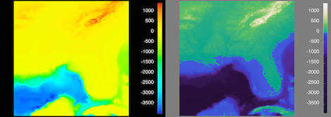
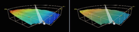
In Figure 1 the traditional rainbow colour map is used on the left, whereas a pseudo-colour map is used on the right. Immediately the differences are noticeable. Figure 1 shows the south-eastern United States with the Floridian peninsula clearly recognisable. Although both images are of exactly the same place, at exactly the same time, using the same scale and colour gradient the results are astonishingly different.
In the image on the left the majority of space is populated by bright yellow, demonstrating land above sea level. The continental shelf of the Gulf of Mexico and the Atlantic Ocean are a mixture of green and cyan. You would be forgiven for believing that the passage between the two landmasses is far narrower and shallower than it is due to the demarcation of the coastline.
This blurring of boundaries highlights the necessity of emphasising zero-crossings. In FarSounder’s latest software update this is showcased by the different colour scales used for signal level and depth; in figure 1 this is highlighted by the switch from blue to green. Topologically the rainbow scale is deceiving, instead of creating gradation it creates what appear to be distinct plateaus – this deception is at least partially corrected by alternative scales.
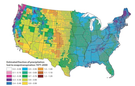
So why does the rainbow scale mislead? It is easier to illustrate the phenomenon using a different type of scale/key. In figure 2 from ‘Cliff Mass’s fantastic weather blog’ the image is displaying the amount of evapotranspiration across the United State counties – the amount of rainwater lost through evaporation – and the problem is made blatant.
Perceivably the United States is divided down the middle; the eastern US is mostly dark green and blue whereas the western United States is largely light green, yellow and orange. This distinction should not exist, the values are gradual and smooth, but visually the division appears to be a sharp and sudden one. There are two central problems, luminance and hue.
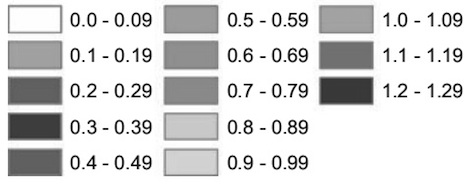
Using a grey scale key the problem of luminance is clearly illustrated. “The colour for 0.3–0.39 is darker than the neighbouring colours, the luminance for 0.5–0.59, 0.6–0.69, and 0.7–0.79 is virtually the same, and then there is a big jump to 0.8–0.89. The step size in terms of the data is no different, it’s simply an artefact of the colour scheme,” explains Robert Kosara of Tableau Software in his article, “How the Rainbow Colour Map Misleads”.
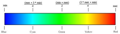
Hue is defined technically as “the degree to which a stimulus can be described as similar to or different from stimuli that are described as red, green, blue and yellow”. Ordinarily colours with the same hue are described using terms that tie them to their hue such as ‘dark red’, ‘sky blue’ and so on. Within the rainbow scale there are eight distinct hues, white, pink, purple, blue, green, greenish yellow, yellow, orange and brown - this rainbow scale has been extended to suit its original purpose but the reasoning is analogous. It has been proven that the best colour maps use a single hue, or in some cases two hues - such as distinguishing the zero-crossing (see fig. 1).
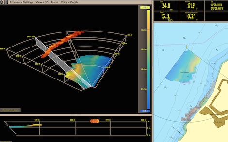
While FarSounder’s new depth colour mapping system does not contain a single hue, there are exceptions to the rule. The luminance of FarSounder’s software ‘monotonically increases’, in other words the luminance does not fluctuate, negating the confusion alluded to in fig 2 and producing an attractive map that does not stray too far from the status quo. However, the FarSounder signal level colour map does contain a single hue and uses an orange-copper colour scale to highlight objects beyond the bottom-mapping limit. “Targets beyond the water depth limit will be displayed with the signal level colour map using the limit setting as set in Signal Level only mode,” explains Matthew Zimmerman in the FarSounder blog. The duality of the two scales produces a clarity that is frequently absent in mapping technologies – an error the scientific community lament. Marketing should play second fiddle to safety.
Signal level: Orange-copper scale
Depth level and signal level in tandem
Jet "rainbow" scale
The FarSounder blog is frank about the benefits of the rainbow scale, describing it as “great for marketing purposes, but…not ideal for the end user”. It is easy to see why; the images that the rainbow scale creates are “dramatic” and eye catching. In an article named “Why Should Engineers and Scientists Be Worried About Colour”, Bernice E. Rogowitz and Lloyd A. Treinish highlight a number of faults associated with inferior colour-mapping scales.
Figure 1
In Figure 1 the traditional rainbow colour map is used on the left, whereas a pseudo-colour map is used on the right. Immediately the differences are noticeable. Figure 1 shows the south-eastern United States with the Floridian peninsula clearly recognisable. Although both images are of exactly the same place, at exactly the same time, using the same scale and colour gradient the results are astonishingly different.
In the image on the left the majority of space is populated by bright yellow, demonstrating land above sea level. The continental shelf of the Gulf of Mexico and the Atlantic Ocean are a mixture of green and cyan. You would be forgiven for believing that the passage between the two landmasses is far narrower and shallower than it is due to the demarcation of the coastline.
This blurring of boundaries highlights the necessity of emphasising zero-crossings. In FarSounder’s latest software update this is showcased by the different colour scales used for signal level and depth; in figure 1 this is highlighted by the switch from blue to green. Topologically the rainbow scale is deceiving, instead of creating gradation it creates what appear to be distinct plateaus – this deception is at least partially corrected by alternative scales.
Figure 2
So why does the rainbow scale mislead? It is easier to illustrate the phenomenon using a different type of scale/key. In figure 2 from ‘Cliff Mass’s fantastic weather blog’ the image is displaying the amount of evapotranspiration across the United State counties – the amount of rainwater lost through evaporation – and the problem is made blatant.
Perceivably the United States is divided down the middle; the eastern US is mostly dark green and blue whereas the western United States is largely light green, yellow and orange. This distinction should not exist, the values are gradual and smooth, but visually the division appears to be a sharp and sudden one. There are two central problems, luminance and hue.
Luminance
Using a grey scale key the problem of luminance is clearly illustrated. “The colour for 0.3–0.39 is darker than the neighbouring colours, the luminance for 0.5–0.59, 0.6–0.69, and 0.7–0.79 is virtually the same, and then there is a big jump to 0.8–0.89. The step size in terms of the data is no different, it’s simply an artefact of the colour scheme,” explains Robert Kosara of Tableau Software in his article, “How the Rainbow Colour Map Misleads”.
Hue
Hue is defined technically as “the degree to which a stimulus can be described as similar to or different from stimuli that are described as red, green, blue and yellow”. Ordinarily colours with the same hue are described using terms that tie them to their hue such as ‘dark red’, ‘sky blue’ and so on. Within the rainbow scale there are eight distinct hues, white, pink, purple, blue, green, greenish yellow, yellow, orange and brown - this rainbow scale has been extended to suit its original purpose but the reasoning is analogous. It has been proven that the best colour maps use a single hue, or in some cases two hues - such as distinguishing the zero-crossing (see fig. 1).
While FarSounder’s new depth colour mapping system does not contain a single hue, there are exceptions to the rule. The luminance of FarSounder’s software ‘monotonically increases’, in other words the luminance does not fluctuate, negating the confusion alluded to in fig 2 and producing an attractive map that does not stray too far from the status quo. However, the FarSounder signal level colour map does contain a single hue and uses an orange-copper colour scale to highlight objects beyond the bottom-mapping limit. “Targets beyond the water depth limit will be displayed with the signal level colour map using the limit setting as set in Signal Level only mode,” explains Matthew Zimmerman in the FarSounder blog. The duality of the two scales produces a clarity that is frequently absent in mapping technologies – an error the scientific community lament. Marketing should play second fiddle to safety.
FarSounder display: Rainbow scale (left), Uniform Gradient Scale (right)
Depth level: Multi-colour, uniform gradient scale
Depth level: Multi-colour, uniform gradient scale
Signal level: Orange-copper scale
Depth level and signal level in tandem
Click here to become part of The Superyacht Group community, and join us in our mission to make this industry accessible to all, and prosperous for the long-term. We are offering access to the superyacht industry’s most comprehensive and longstanding archive of business-critical information, as well as a comprehensive, real-time superyacht fleet database, for just £10 per month, because we are One Industry with One Mission. Sign up here.